Charlie’s Coffee Co.
Manitou, MB
Charlie's Coffee Co. is the place to be if you want a hand-crafted drink or homemade treat. Located in the heart of Manitou, its owners have created a “third space” where everyone in the community can feel welcome. The brand is fun, joyful, friendly, casual, approachable, slightly feminine, and young at heart.
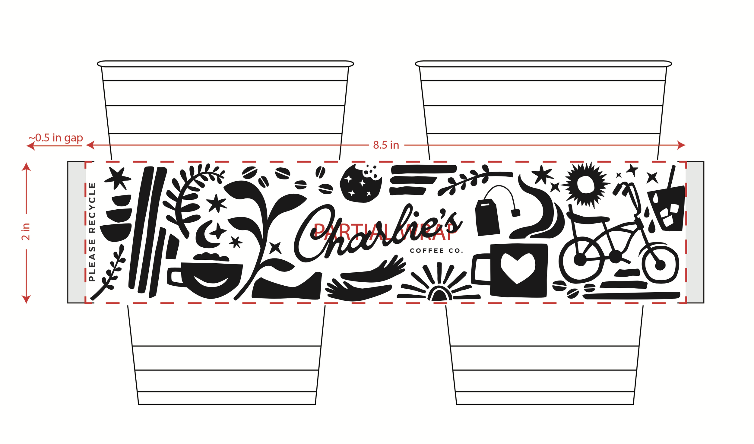
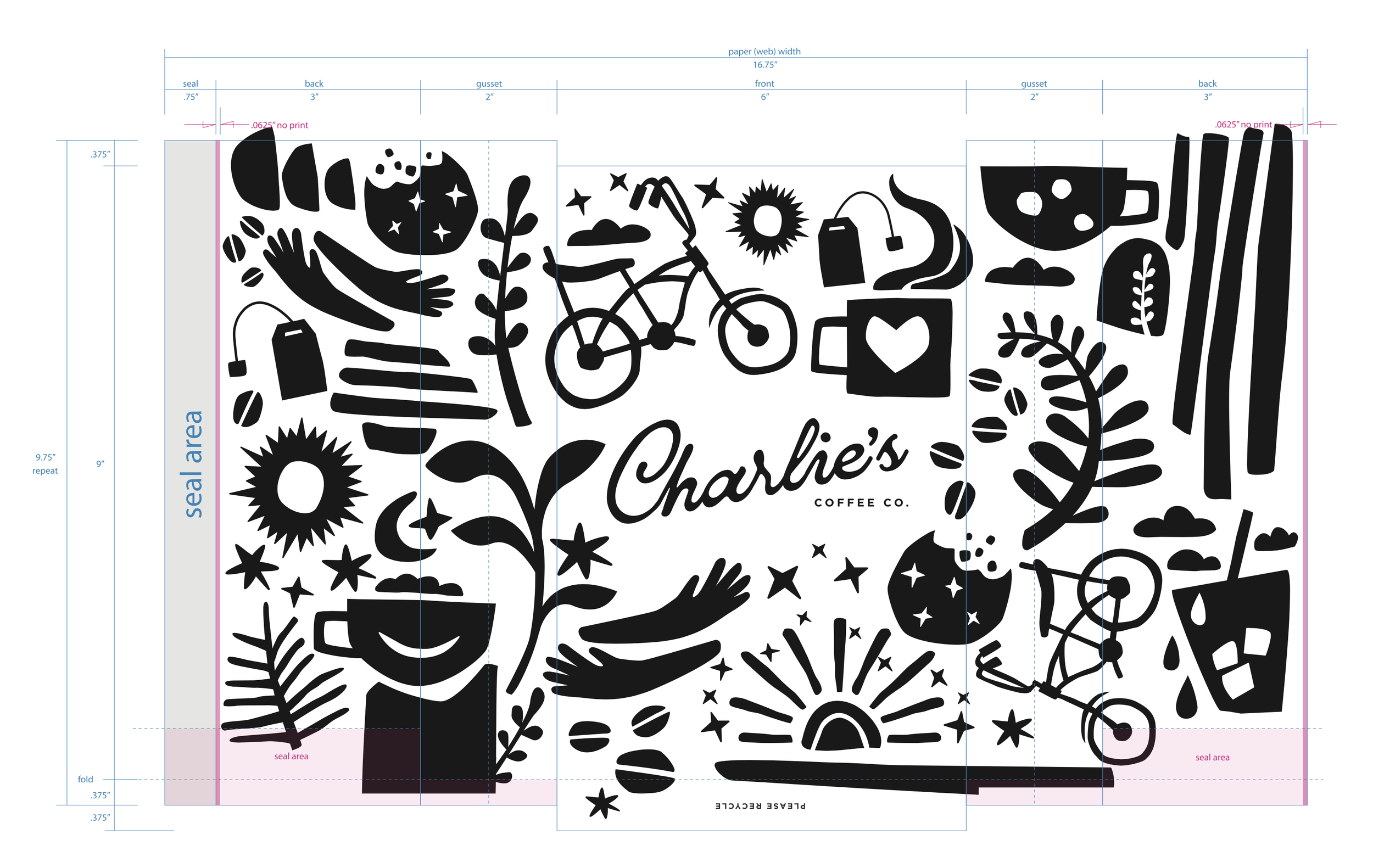
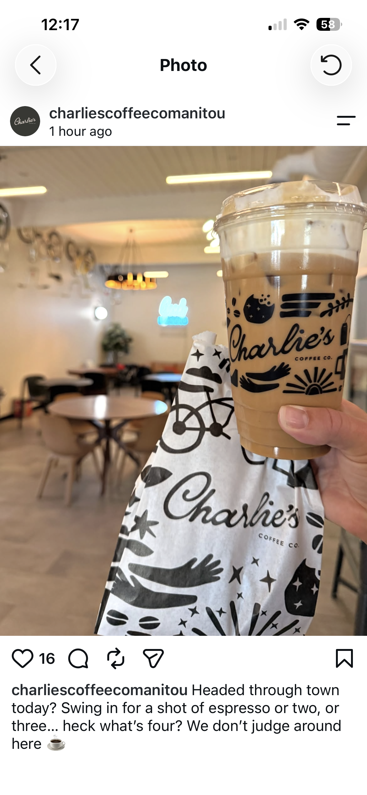
Its existing brand featured a beautiful script logo, playful illustrations of a personified cookie and cup, and a primarily black-and-white palette. The task was to create graphics for take-out cold cups and a pastry bag that would complement this brand.
Charlie’s interior reflects the brand’s casual, black-and-white aesthetic, with playful light fixtures, rounded menu-wall alcoves, vintage bikes hanging from the ceiling, neon signage, local art, and a living plant wall. The shop sells fresh cookies, pastries, and hot and cold drinks, plus it has a retail area showcasing local vendors.
After exploring a variety of concepts including playful quotes, window-scenes “looking into the cafe,” and abstract and geometric patterns, the client and I chose to build a one-colour pattern from everyday objects unique to the shop, all centred on the logo. The logo’s imperfect, organic, black cursive style was a natural starting point. Bikes, plants, cookies, stars, a sun, coffee beans, imperfect organic shapes, and smiles, combine into a collaged pattern that represents the Charlie’s brand.
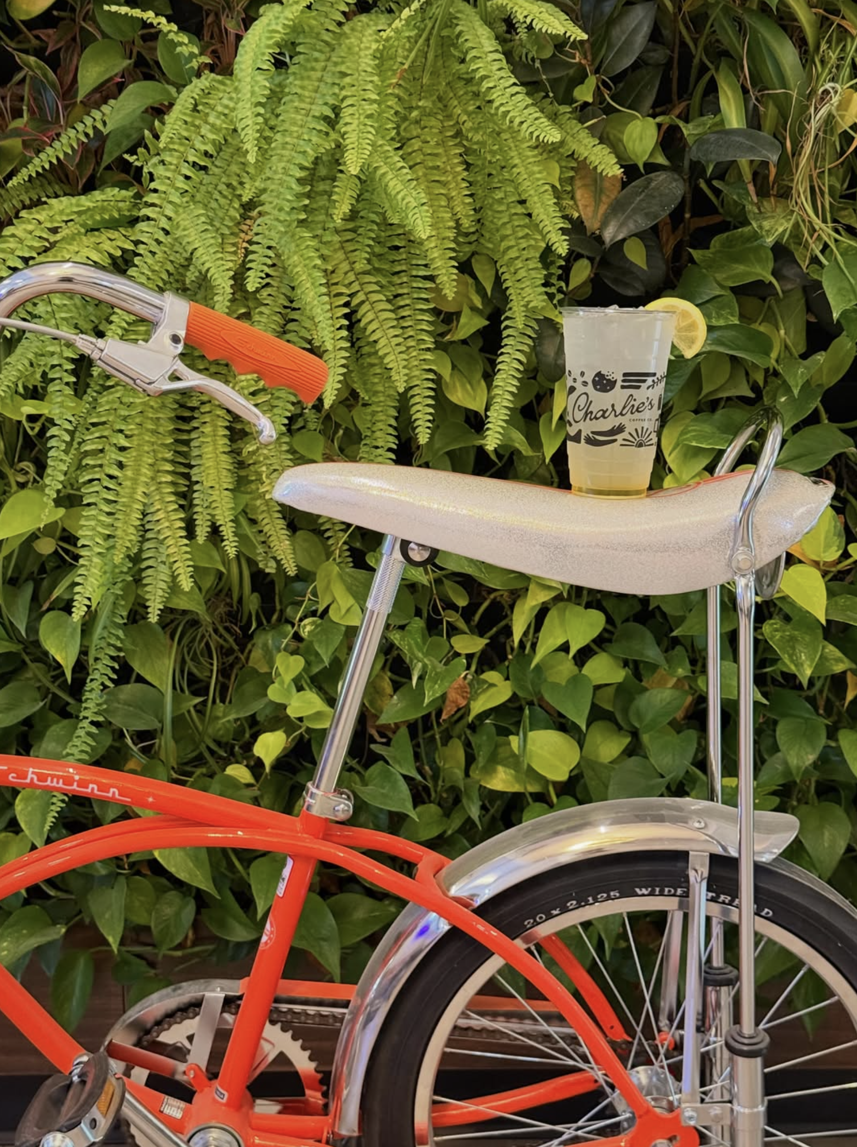
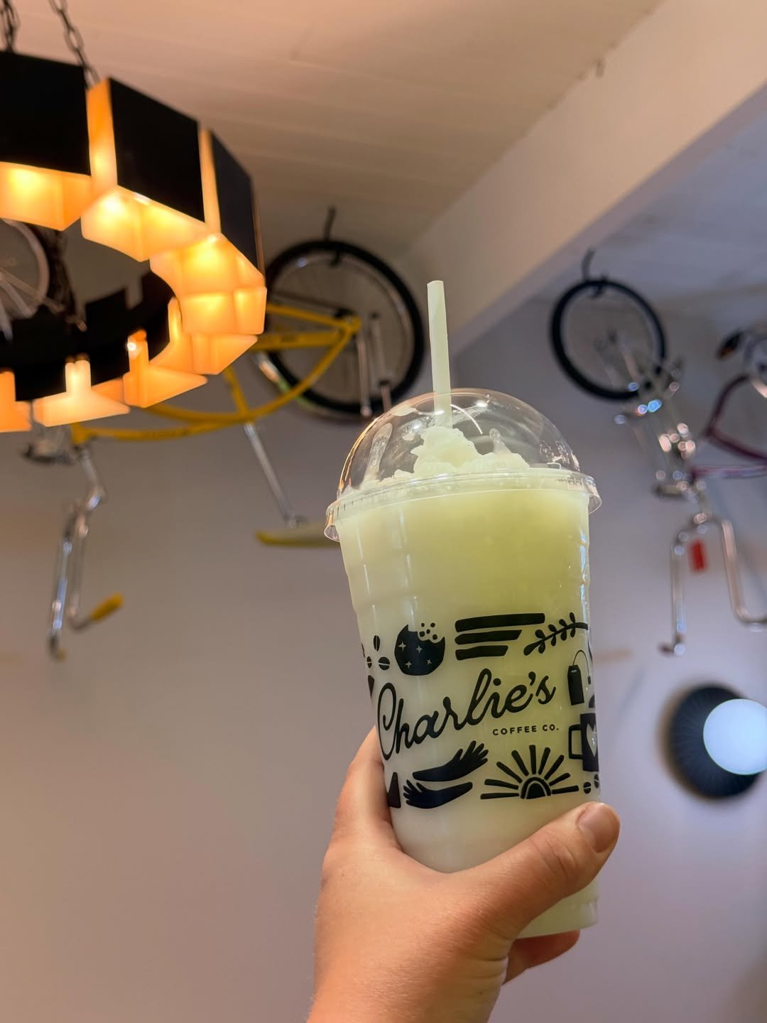
The new packaging has been well received by the community and gives baristas and customers a fun photo-op for social media.
Photos courtesy of Charlie’s Coffee Co. Instagram account
Printing: Georgette Packaging
PACKAGING ILLUSTRATION + DESIGN + PRODUCTION OVERSIGHT