
Noricum Manual Therapy
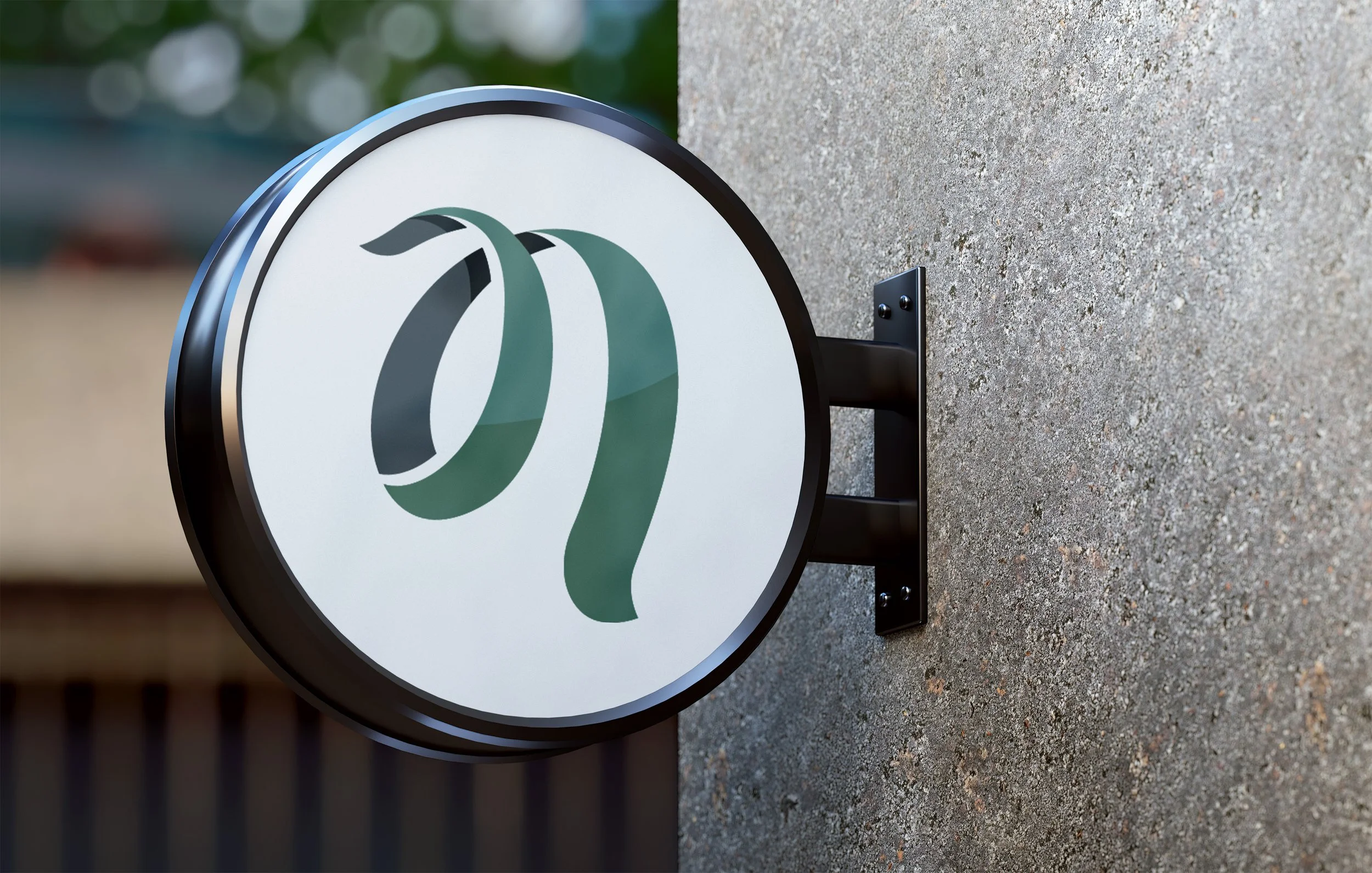
I collaborated with Flo on the redesign of his osteopathy practice logo, aiming to capture the essence of movement, energy, and balance. Inspired by the natural forms of spirals and the use of negative space, the design moves away from the common literal imagery of hands often seen in manual therapy branding, instead opting for a more abstract and contemporary visual identity. The final logo was developed in both English and Spanish, ensuring versatility across applications such as business cards and signage.
LOGO REDESIGN

This was the original logo. We moved away from a literal representation of manual therapy to a more abstract representation of energy and movement.