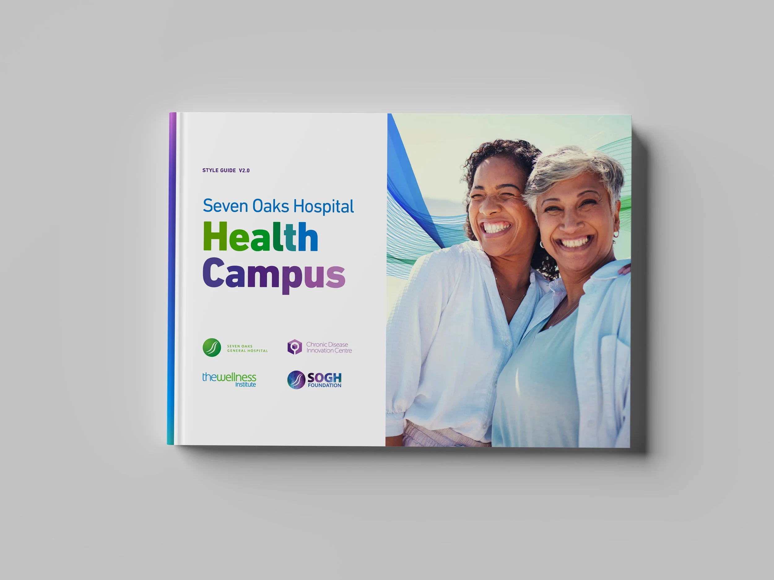
Seven Oaks Hospital
Health Campus
The Seven Oaks Hospital Health Campus is an incredible initiative in north Winnipeg, bringing together four different entities—The Wellness Institute, Seven Oaks General Hospital, The Seven Oaks Hospital Foundation, and the Chronic Disease Innovation Centre. The challenge, though, was that each of these organizations looked and felt separate, and the overall campus didn’t have a unified identity. Without a shared visual language, it was hard to see how these different parts were working together toward the same goal.
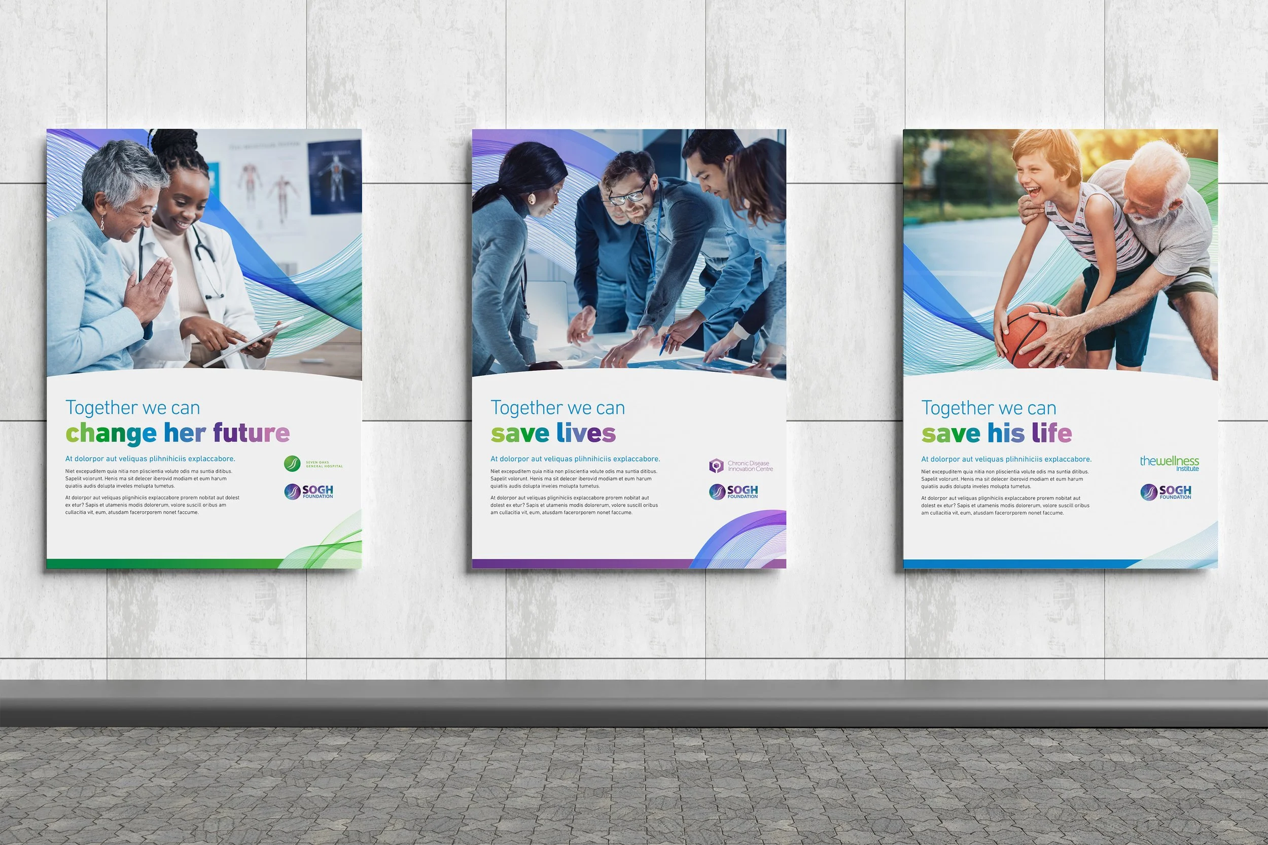
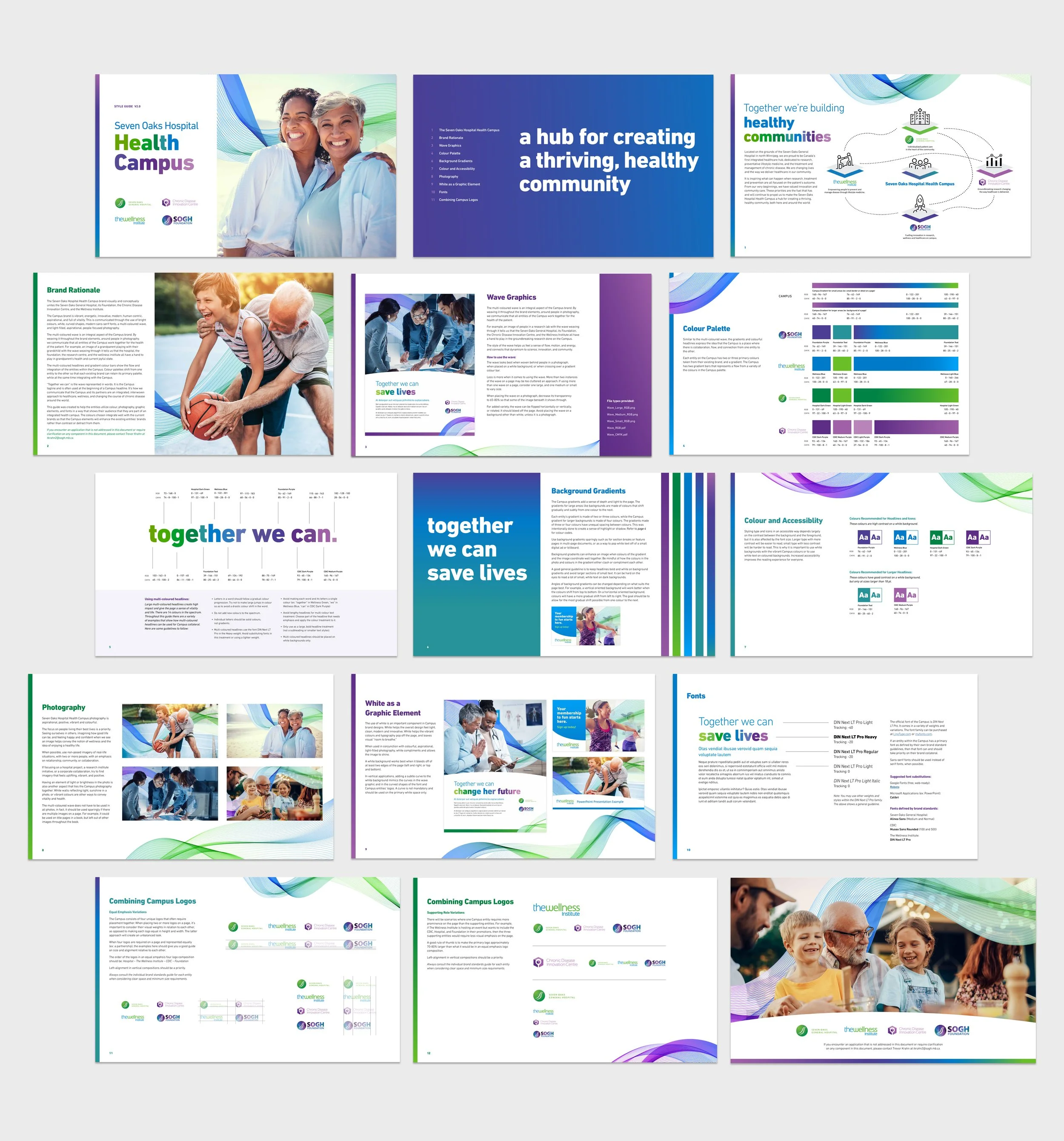
Our solution was to create a brand system that tied everything together while still giving each entity room to shine. We built a cohesive colour palette, chose modern, human-centric fonts, and designed a multi-coloured wave that flows throughout the visuals. That wave became a powerful storytelling element, symbolizing how the four parts of the campus are interconnected and working “together” to build healthy communities.
The result is a vibrant, energetic, and inspiring brand. Bright colours, light-filled photography, and curved shapes reflect innovation and vitality while still keeping people at the center of the story. For example, a photo of a grandparent playing with their grandchild comes to life when the wave weaves around them, visually showing how every part of the campus contributes to that moment of joy and health.
This new visual identity doesn’t erase or compete with the existing brands of each entity, it enhances them. By weaving the shared elements into their communications, we’ve created a system where each building feels like part of a bigger picture. The campus now presents itself as one united health hub, transforming how healthcare, wellness, and research are experienced, not just in Winnipeg, but as an example for communities everywhere.
BRAND STANDARDS STYLE GUIDE | POSTER TEMPLATES | SLIDE DECK TEMPLATES | BRAND ASSETS | COPYWRITING
AGENCY: Fusion Communications Group Inc.