
Blumstein Brewing Co.
When designing Blumstein Brewing Co.’s branding, I set out to capture its Mennonite roots, prairie farm heritage, and playful spirit in a way that felt bold, fun, and distinctive. I wanted locals to notice the German beer names, feel a sense of local pride, or be curious enough to pull a can off the shelf.
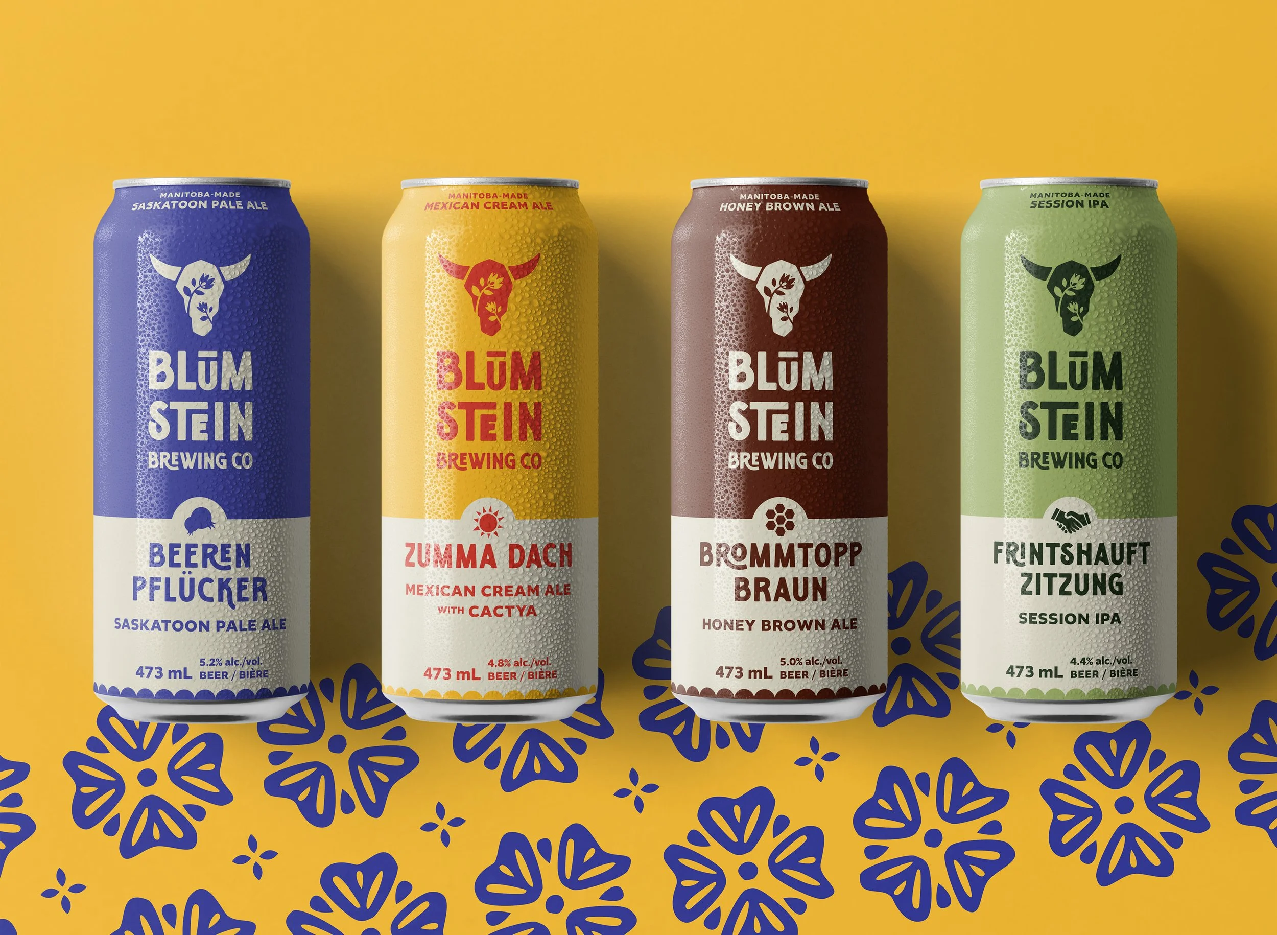
The logo—a cow skull adorned with folk-art florals—nods to the brewery’s origins on a former dairy farm in what was once the village of Blumstein (German for “flower” and “rock”). The imperfect, hand-crafted font takes inspiration from old milk bottle and crate designs. By balancing masculine and feminine elements, the logo feels both nostalgic and fresh.
Like many craft breweries, Blumstein Brewing Co. needed a visual identity that could be both recognizable and flexible—accommodating unique and seasonal can designs, contributions from other designers or artists, and an expanding family of brews. The logo’s stamp-like simplicity and one-colour design offer the flexibility needed for beer labels, stickers, carved wooden taps, and merch, all while maintaining a consistent brand character.
For the brand and can designs, I used bold, graphic simplicity, using a Mennonite-inspired pattern and vintage milk-crate design-inspired aesthetics. Each of Blumstein Brewing Co’s core beers features a German name, an English translation, and a distinct icon to make it instantly recognizable. Brand colours were chosen to reflect rural life in a vibrant, approachable way—like a berry-toned blue for Beeren Fluker, a Saskatoon Pale Ale.
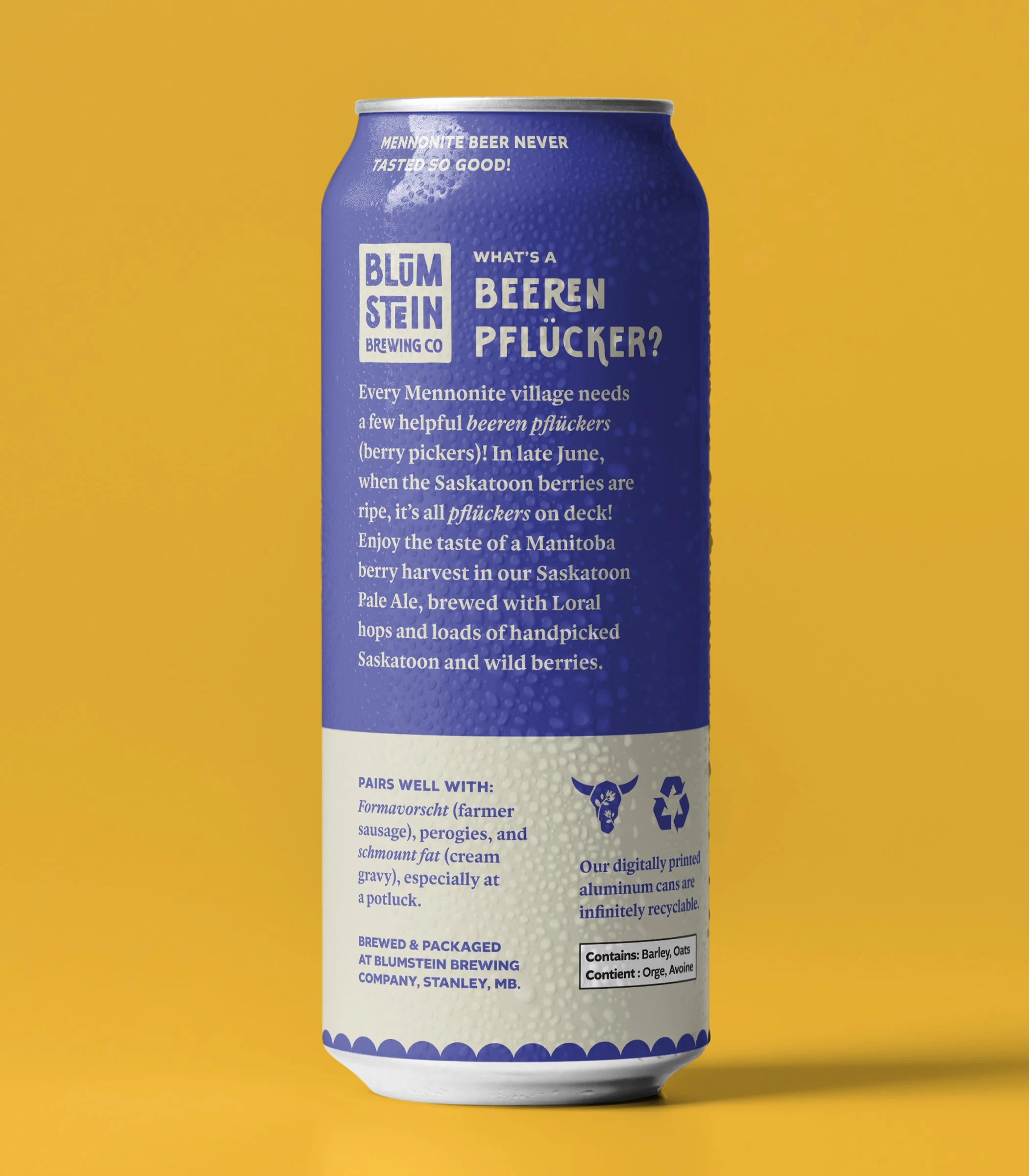
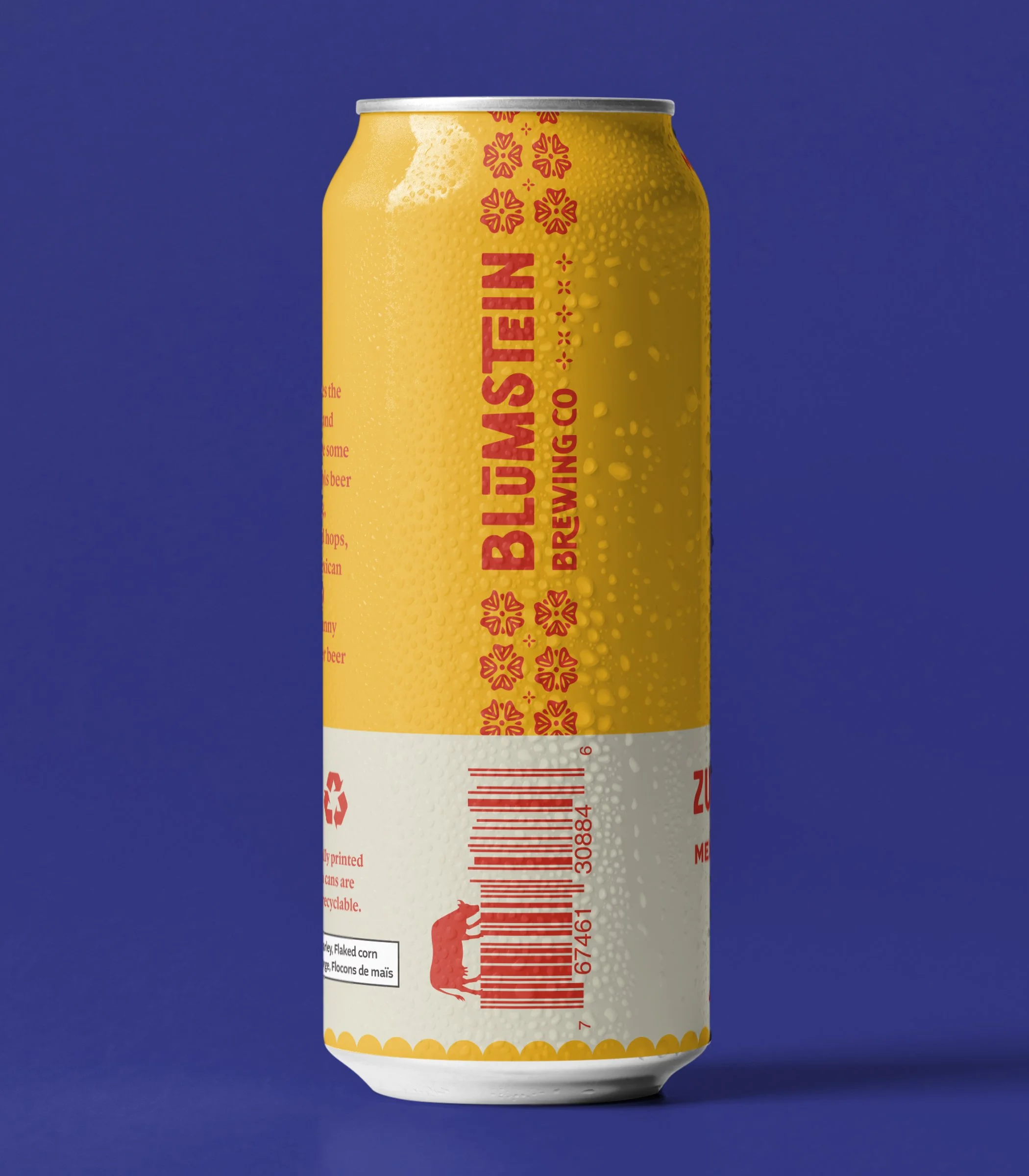
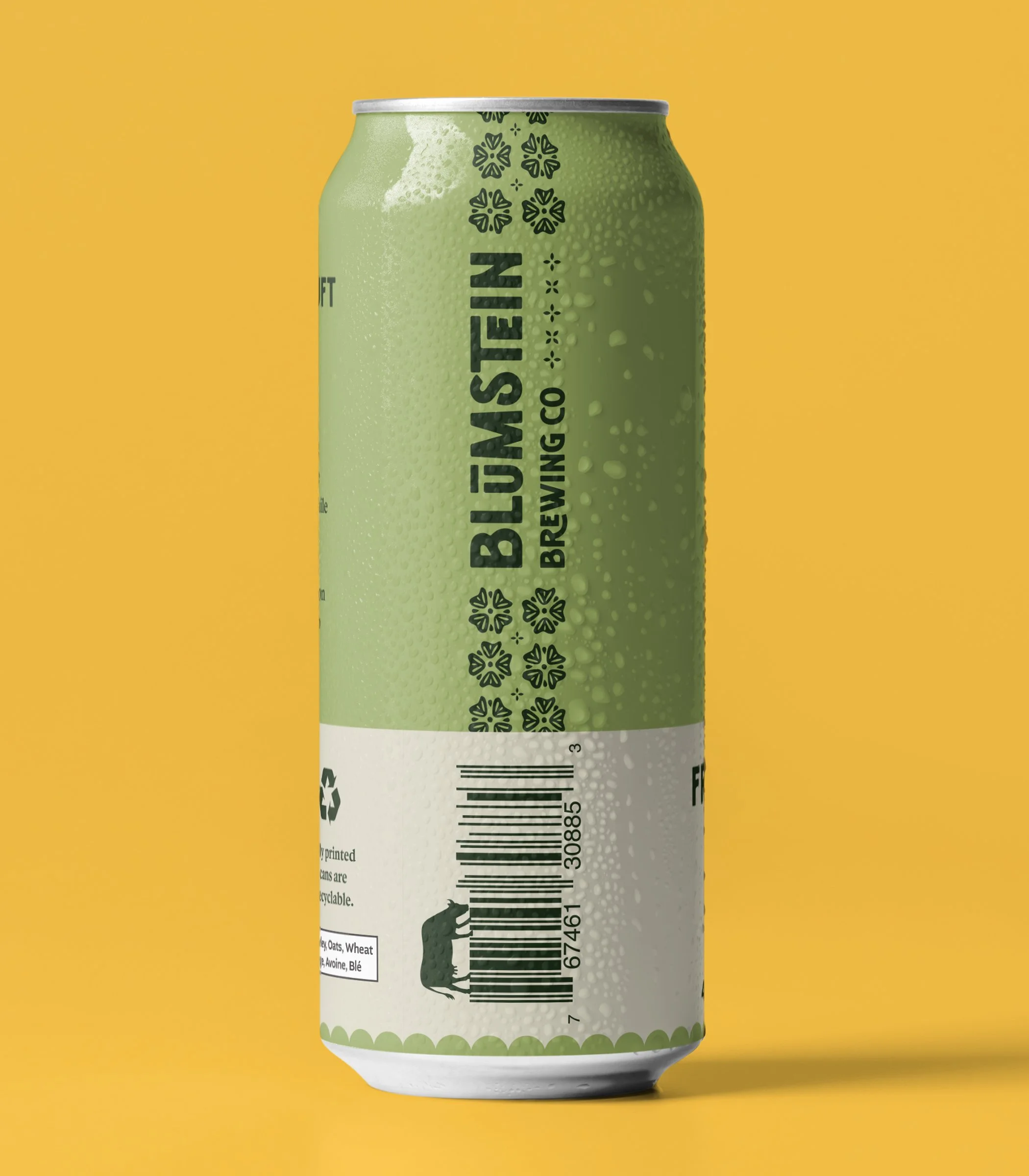
Beyond the visuals, I wanted the cans to invite curiosity and discovery. Humorous beer name definitions, cheeky pairing suggestions, and unexpected details—like a cow grazing on the barcode—add layers of fun to the beer-drinking experience.
Mennonite beer never tasted so good!
BRANDING IDENTITY | PACKAGING DESIGN | MERCH DESIGN
2025 RGD Branding Awards Winner
2025 Signature Awards Finalist


Product photos taken in the Blumstein Brewery environment, courtesy of Alejandro Penner.
STYLE GUIDE